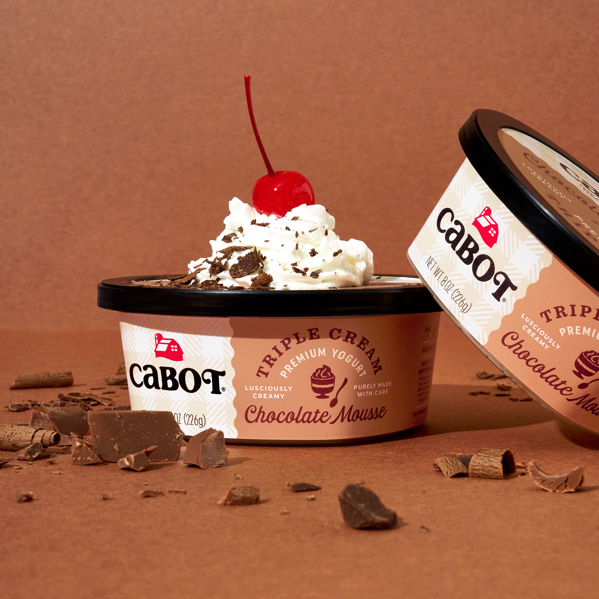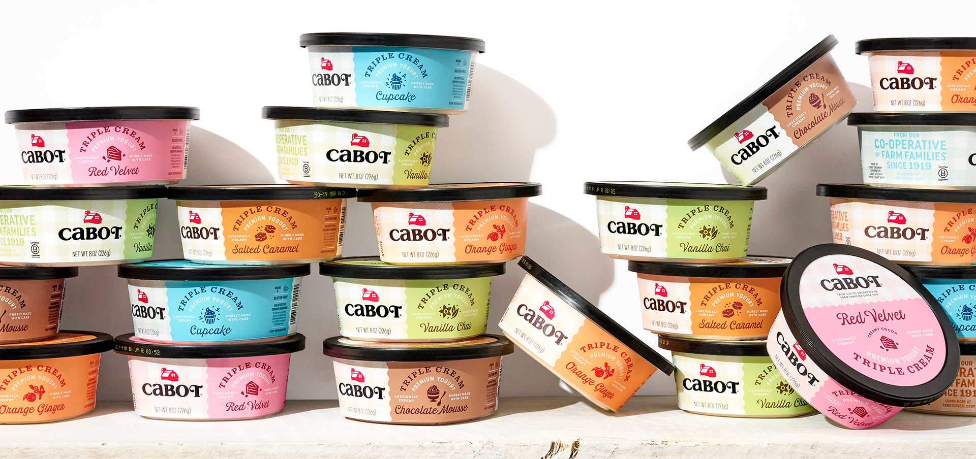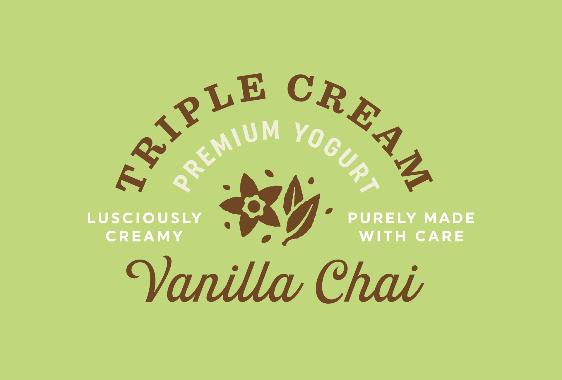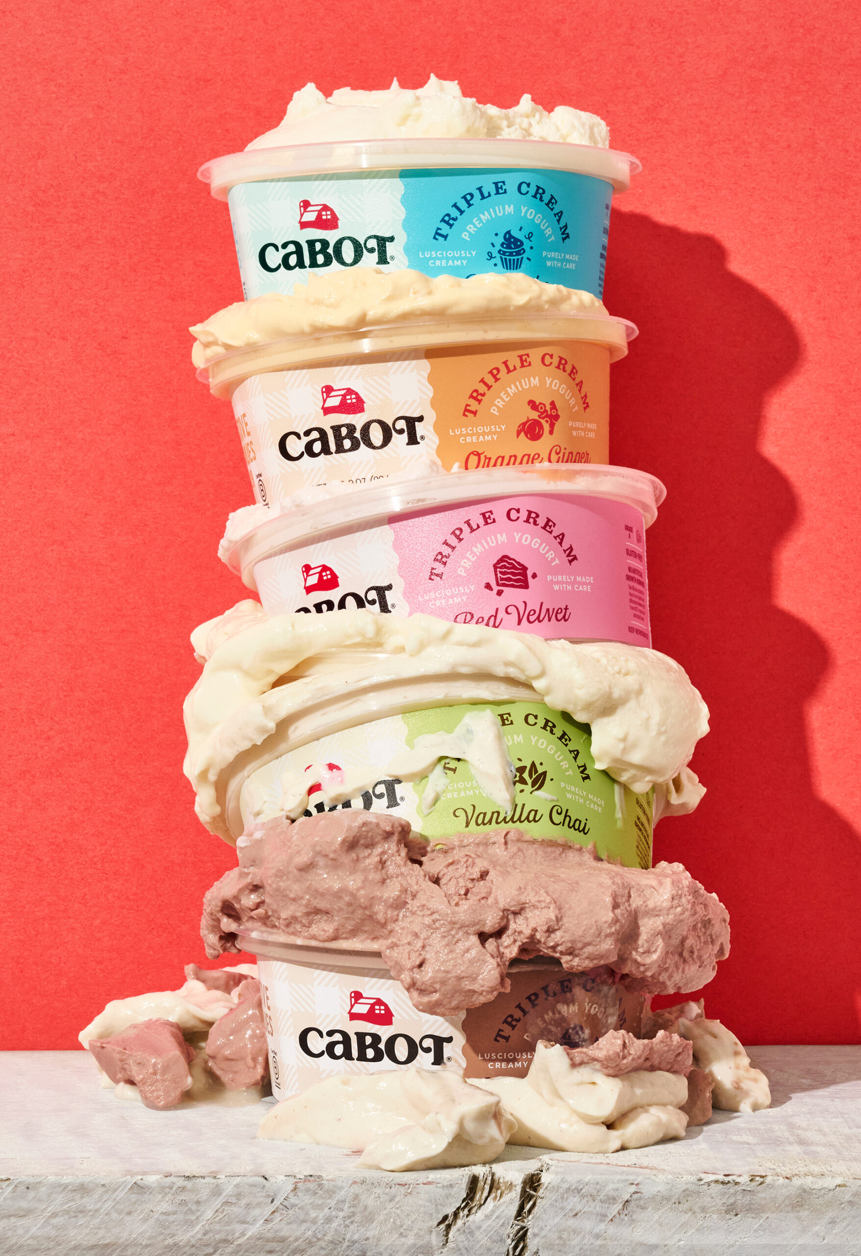
CABOT CREAMERY
TRIPLE CREAM YOGURT
Client
Cabot Creamery
Co-Operative
Services
Branding
Packaging Design
Custom Typography
Visual System
Icon Illustration
Photo Art Direction
Credits
Designed at Werner Design Werks
Creative Direction: Sharon Werner
Photography: Ken Friberg
Credits
Designed at Werner Design Werks
Creative Direction: Sharon Werner
Photography: Ken Friberg
Project Info
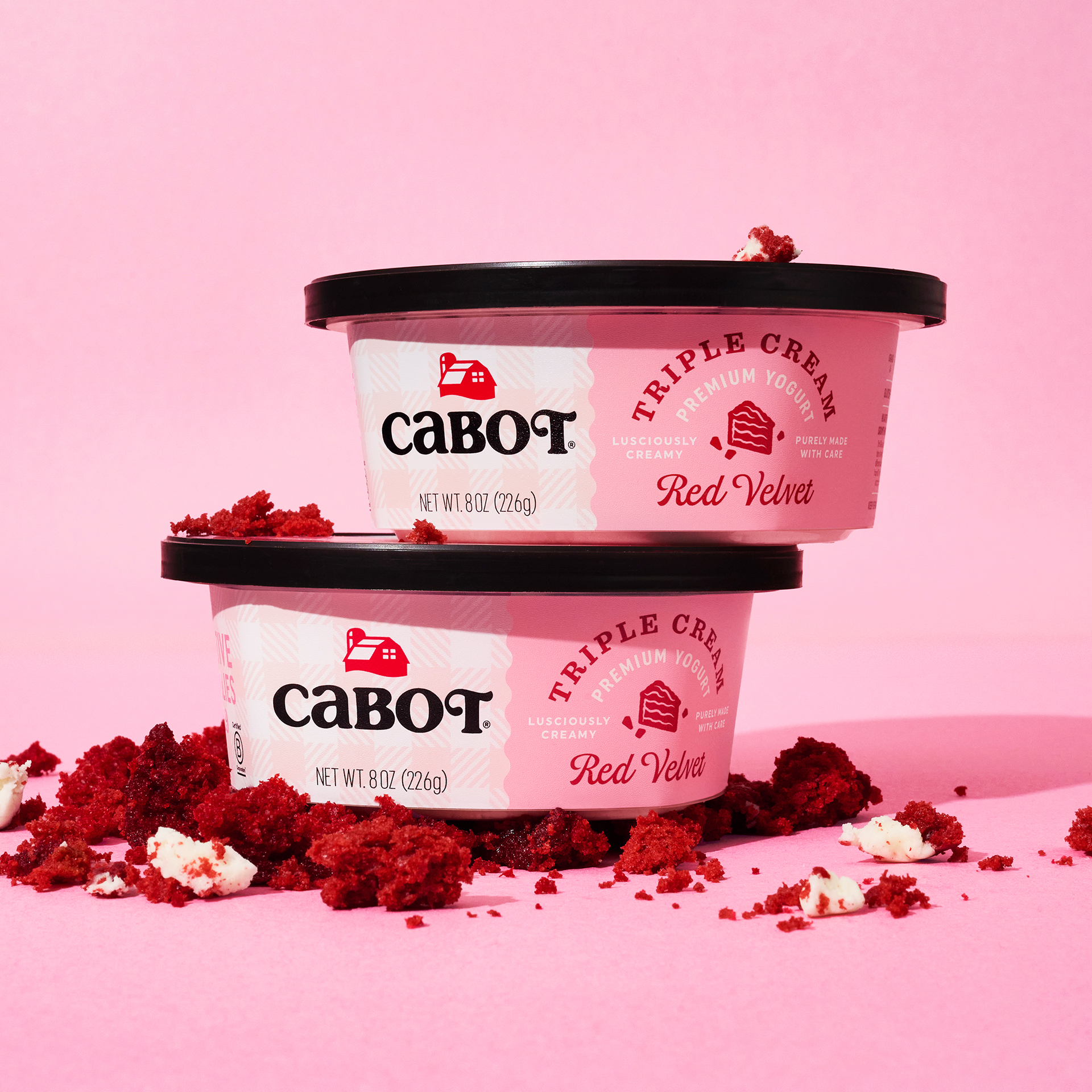
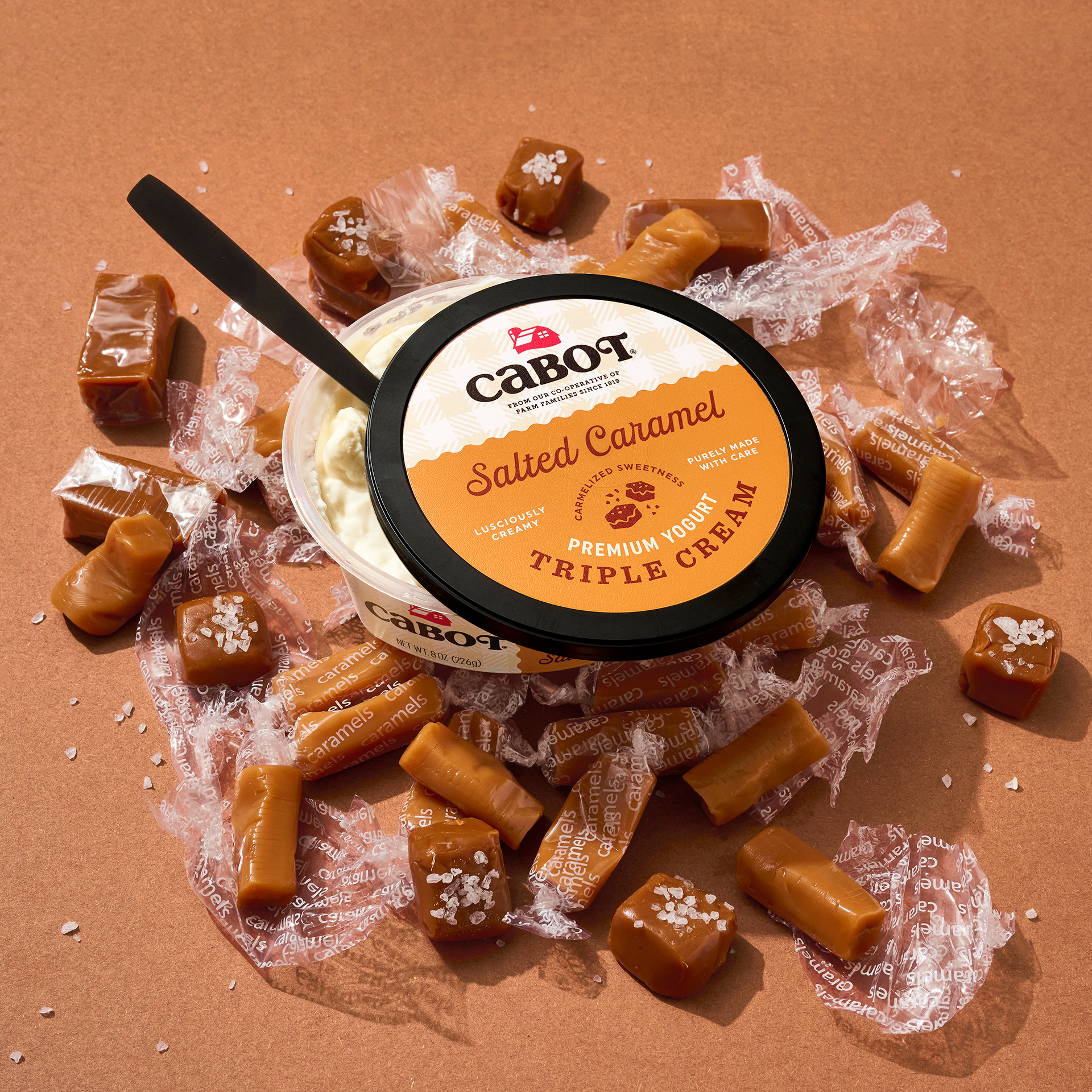
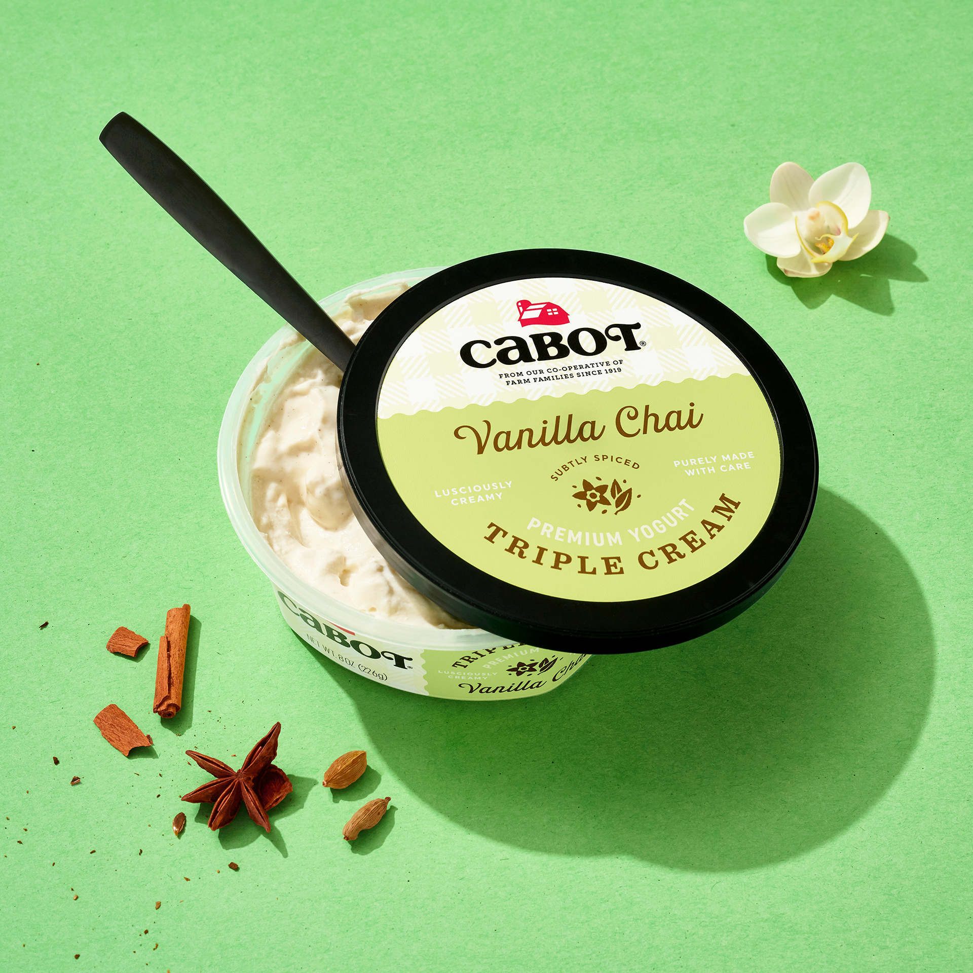
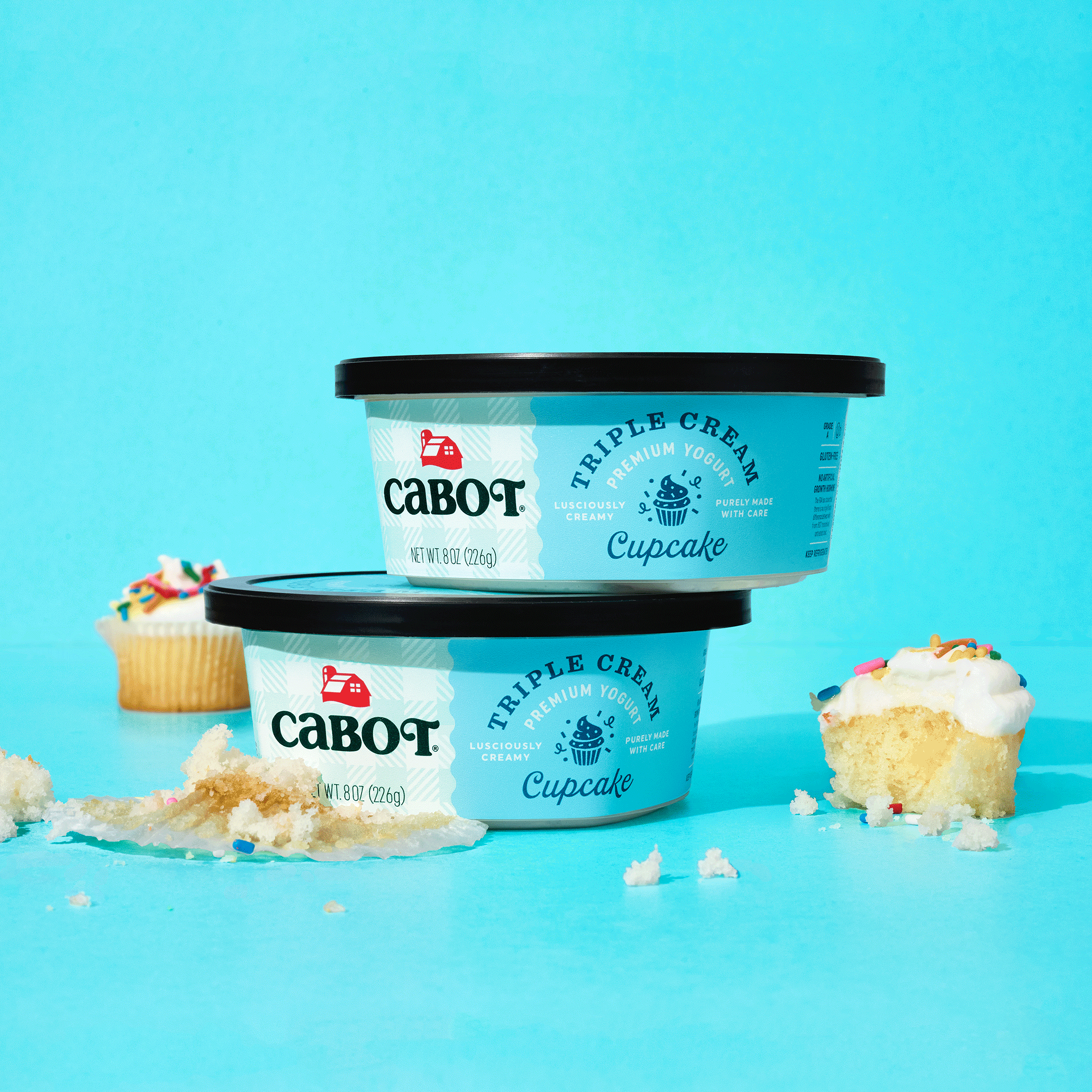
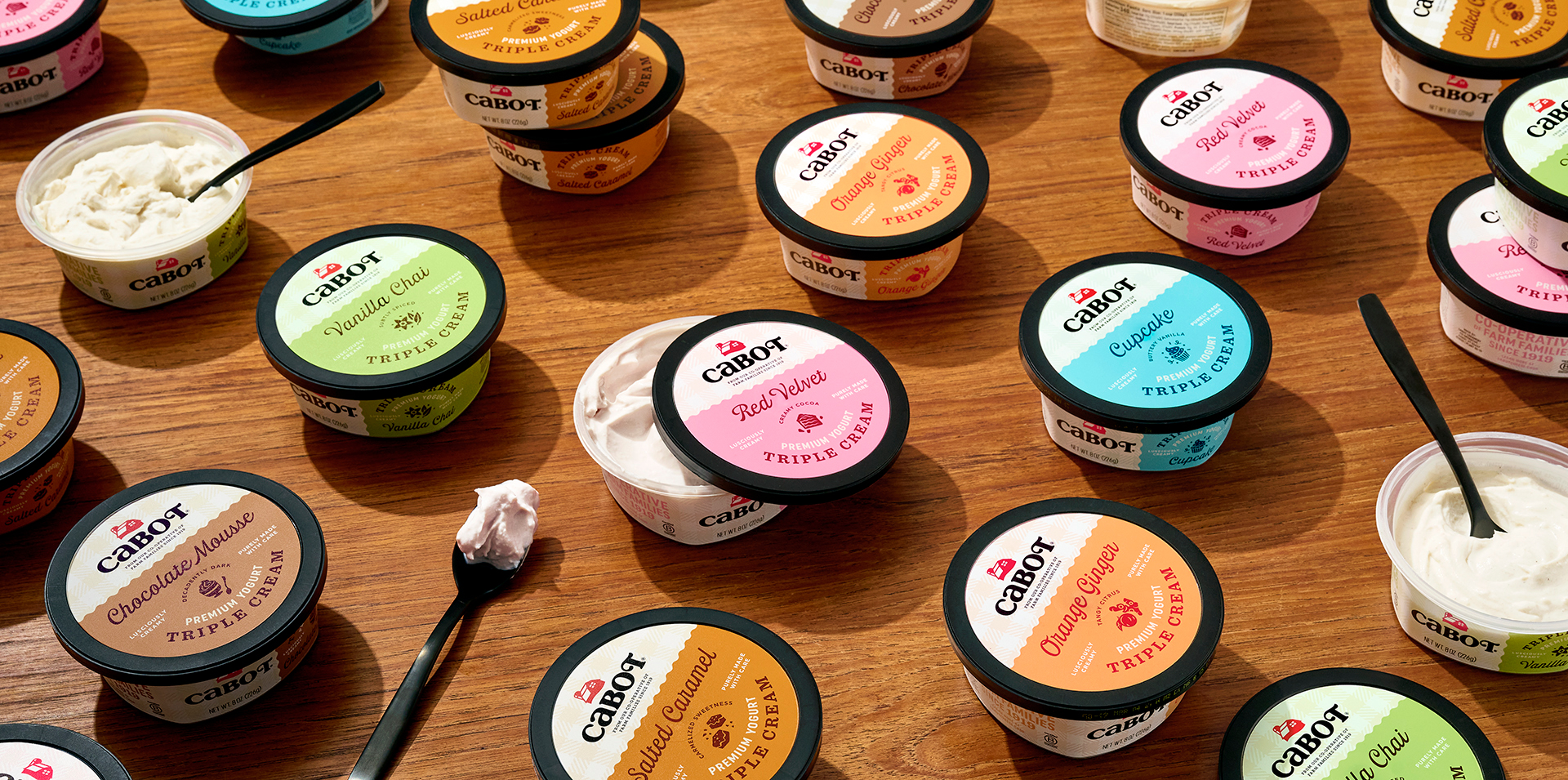
Since 1919, Cabot Creamery co-operative has been producing the country’s purest, farm fresh, healthy, award-winning dairy and cheese products. Now they’re taking this farm-to-table goodness and creating over the top delicious and indulgent Triple Cream premium yogurts. As with all Cabot products, the goal was to communicate Cabot’s authentic heritage and build on the “modern rustic” aesthetic that’s synonymous with the brand: beloved plaid, simple but tasty flavor icons, & farm family messaging. Adding in creamy indulgent colors and a script reminiscent of a vintage dairy vernacular.