CABOT CREAMERY
CULTURED REDESIGN
Client
Cabot Creamery
Client
Cabot Creamery
Services
Branding
Packaging
Photo Art Direction
Custom Typography
Icon Illustration
Services
Branding
Packaging Design
Custom Typography
Visual System
Icon Illustration
Credits
Designed at Werner Design Werks
Creative Direction: Sharon Werner
Photography: Ken Friberg
Customized Font by: Cahya Sofyan
Credits
Designed at Werner Design Werks
Creative Direction: Sharon Werner
Photography: Ken Friberg
Customized Font by: Cahya Sofyan
Project Info
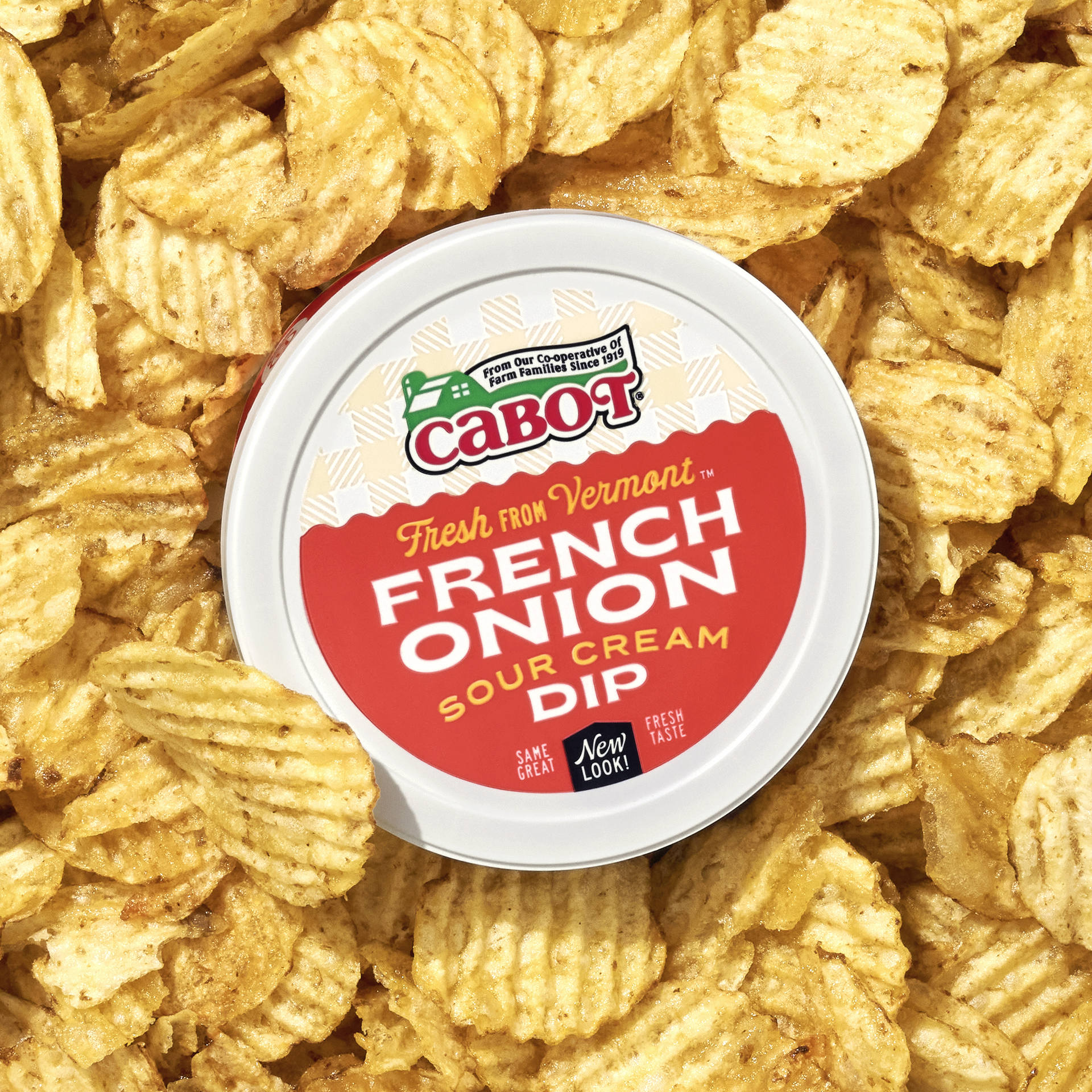
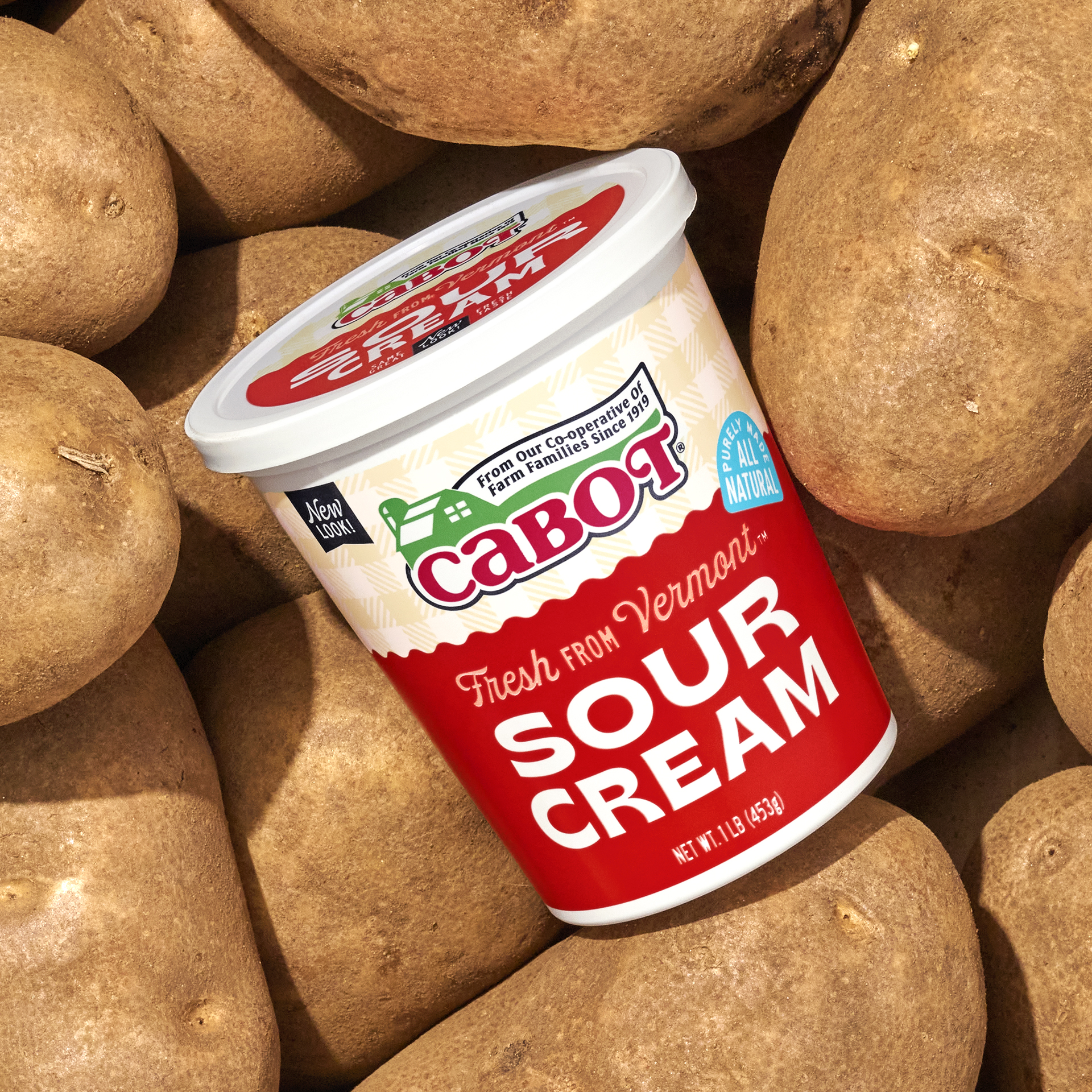
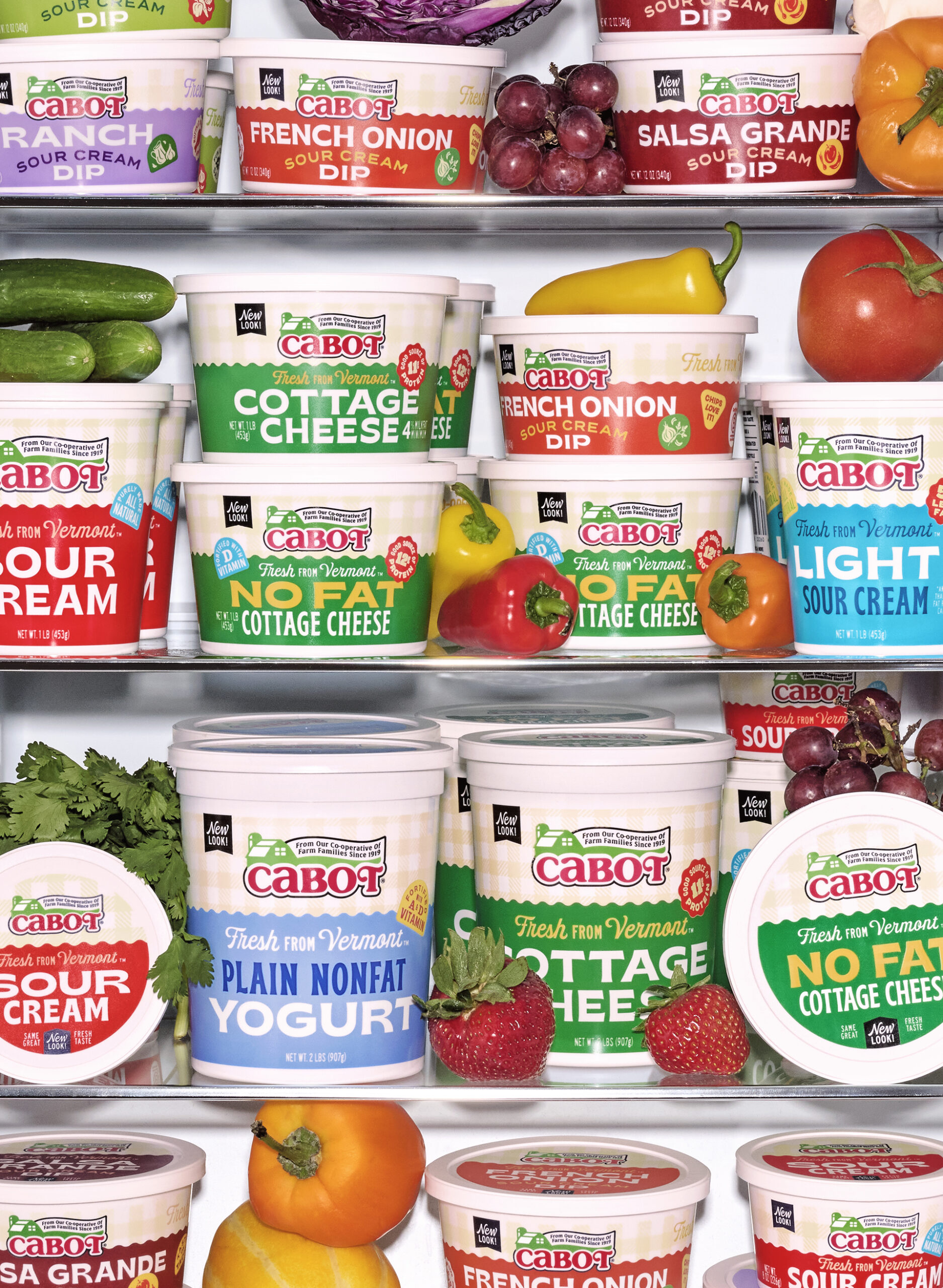
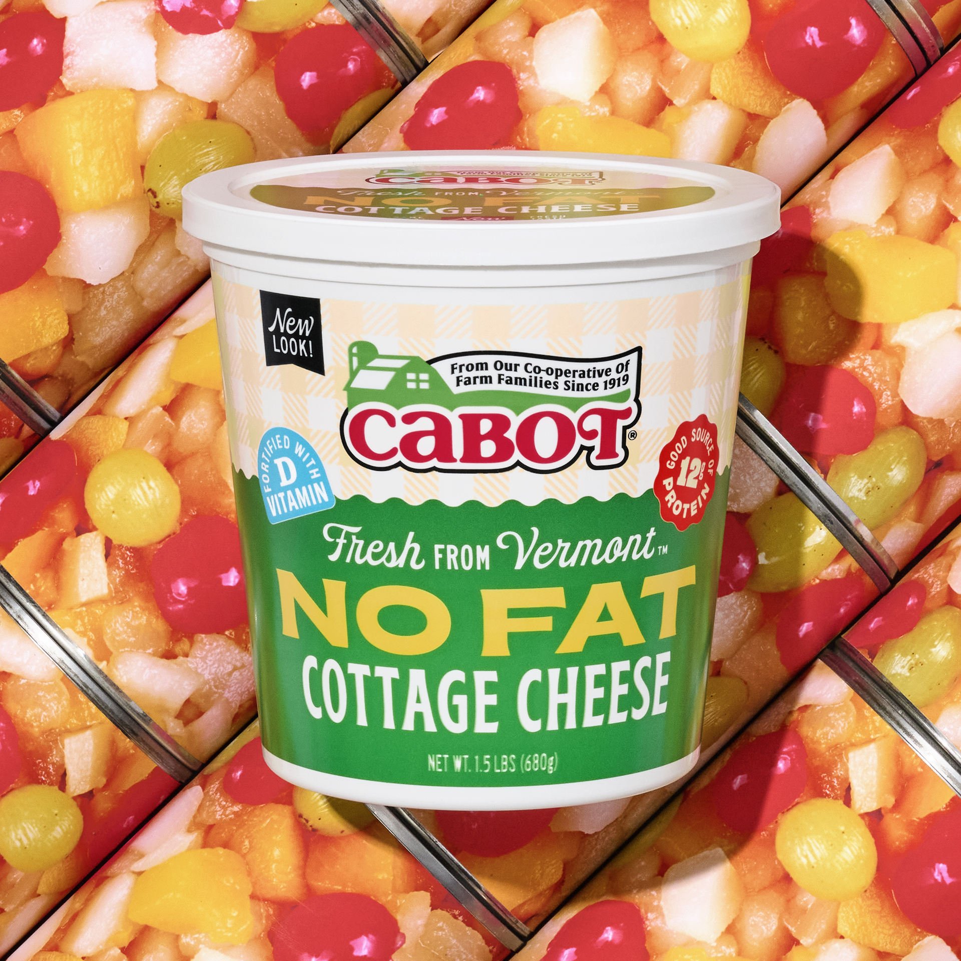
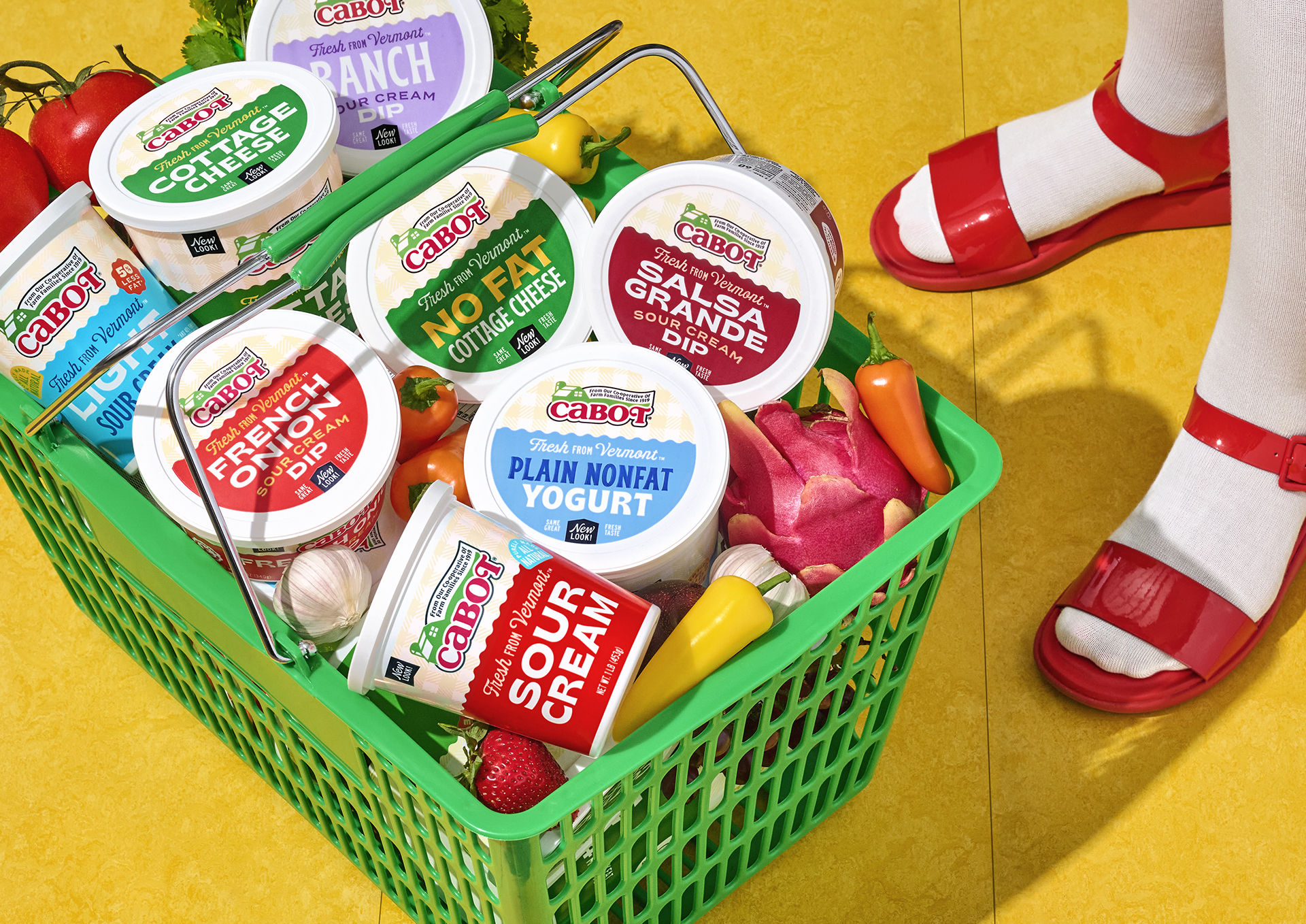
Cabot tasked us with creating an iterative design solution for their Cultured dairy line.
We started this process by auditing Cabot’s current Cultured line, and taking note of identifiable & positive elements to retain and refine. From this our goals were to:
- Communicate Cabot Farmer commitment to quality
- Communicate Award-winning reputation
- Build on the Modern Rustic aesthetic
- Create appetite appeal
- Inspire creative usage of product
- Engage new Millennial customers while being familiar to current customers
- Revise language & hierarchy to be more accessible & fun
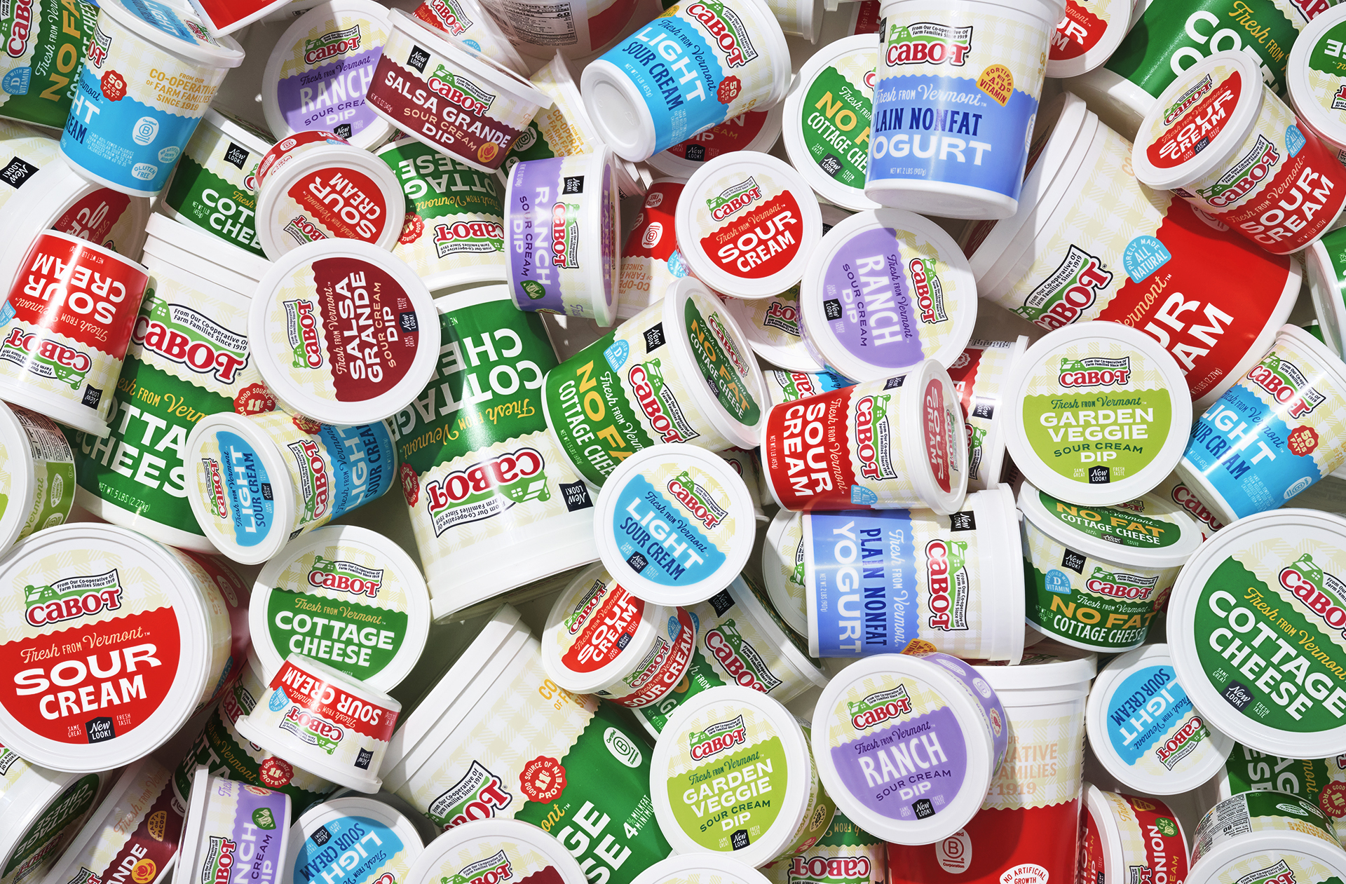
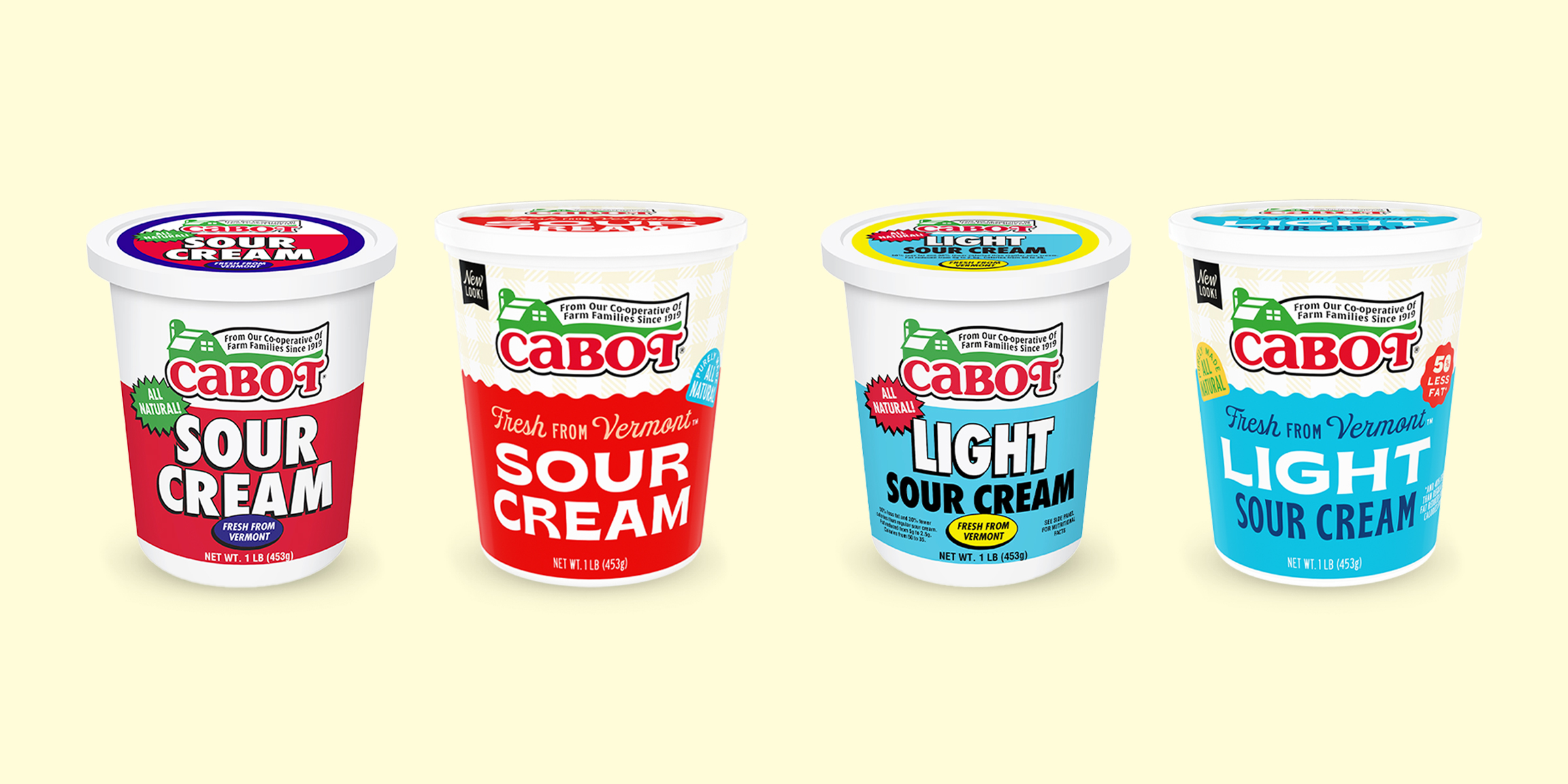
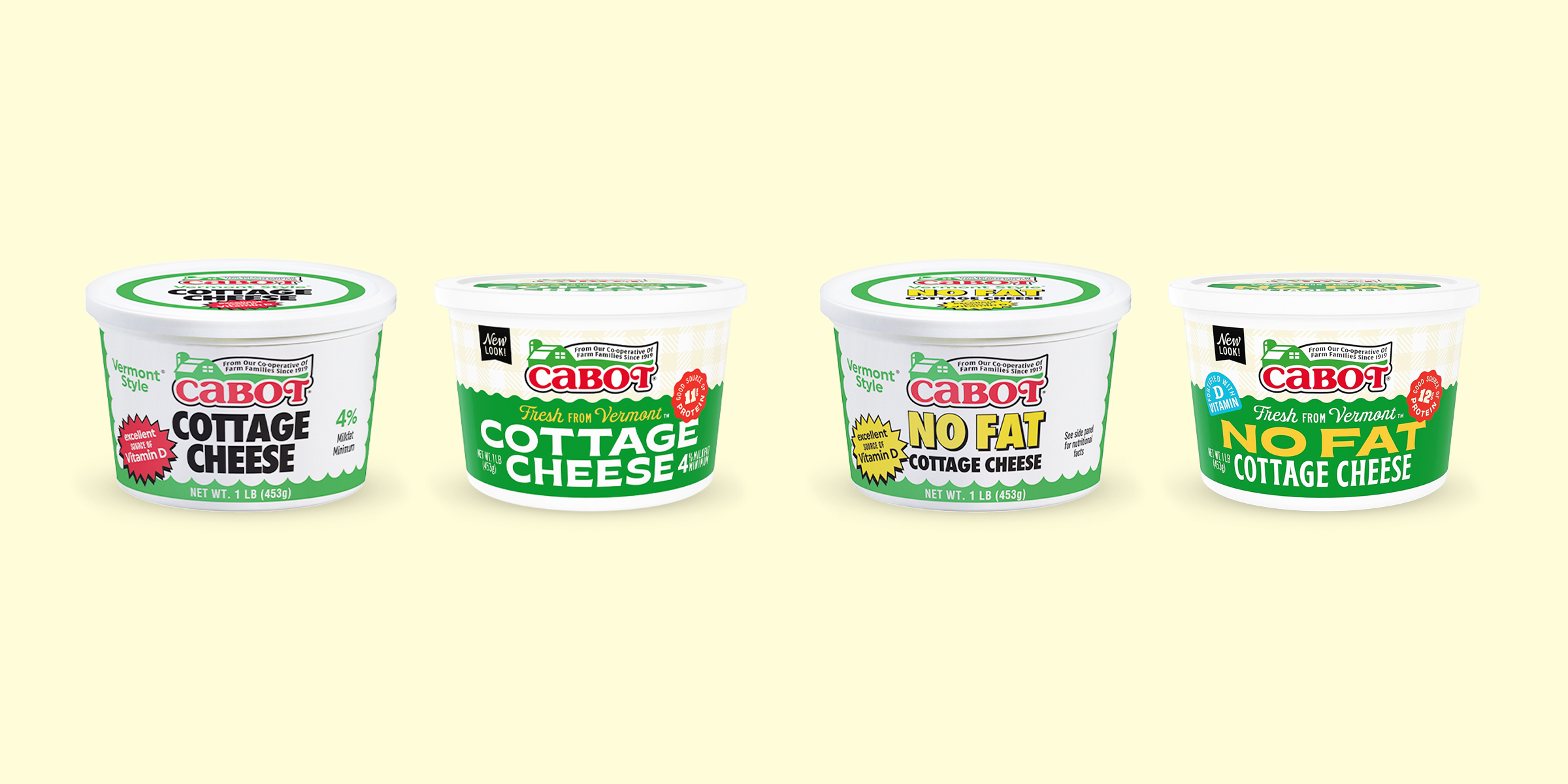
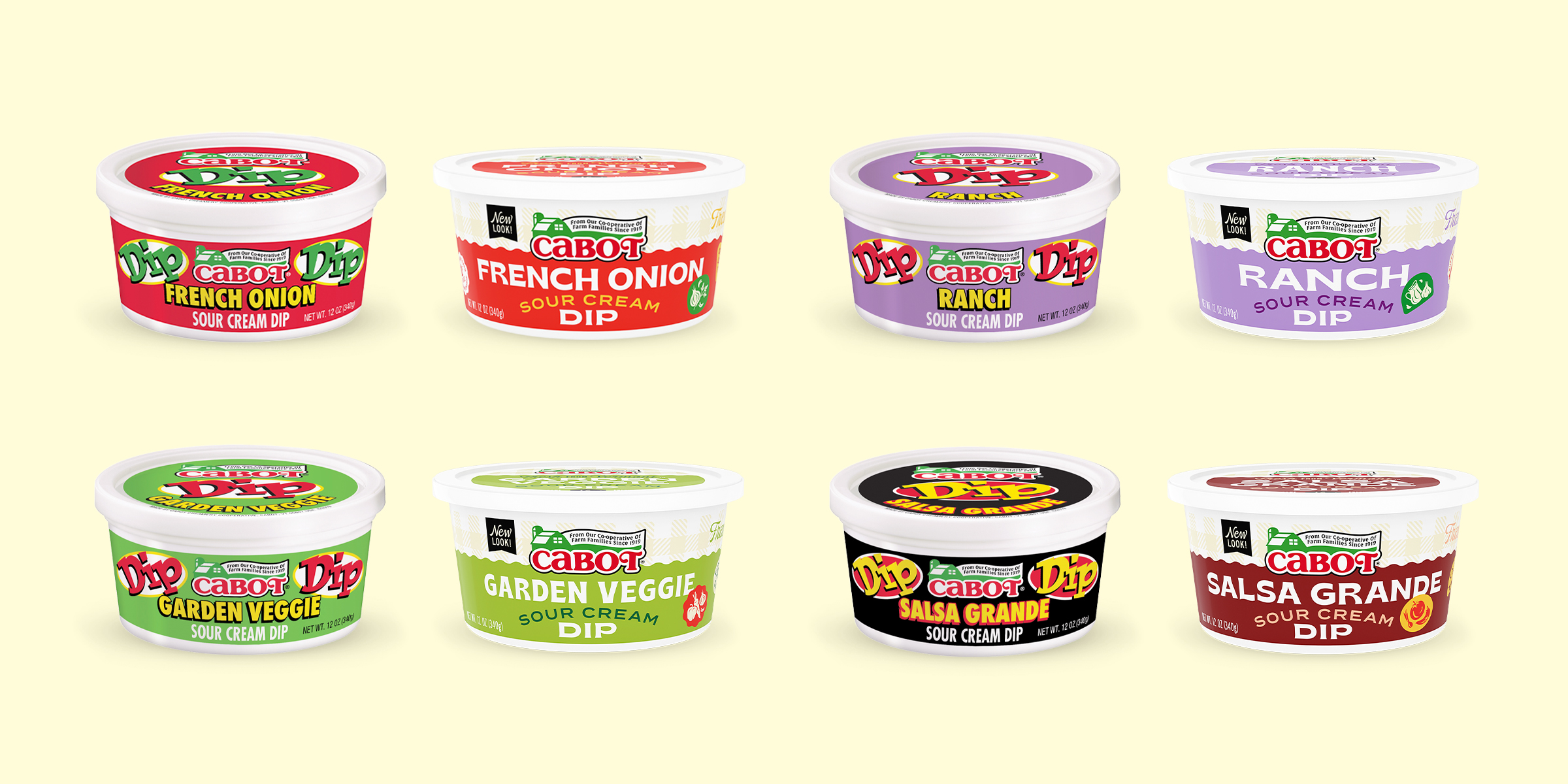
We decided to retain several aesthetic elements from the previous packaging.
Colors within the category are well known to communicate specific meanings like “No Fat” or “Light” so there was justification in keeping the current color palette. However, we made significant refinements to the value and combinations of those colors to give them that warm, tasty Cabot appeal.
Current packaging callouts sometimes existed in a bold and activated way, but didn’t reflect the Cabot modern/rustic aesthetic. We refined these callouts to feel more like stickers that leveraged Cabot’s authentic dairy vernacular. And now included flavor cues, health attributes, inspirational usage & Cabot company certifications that were once hidden & overlooked.
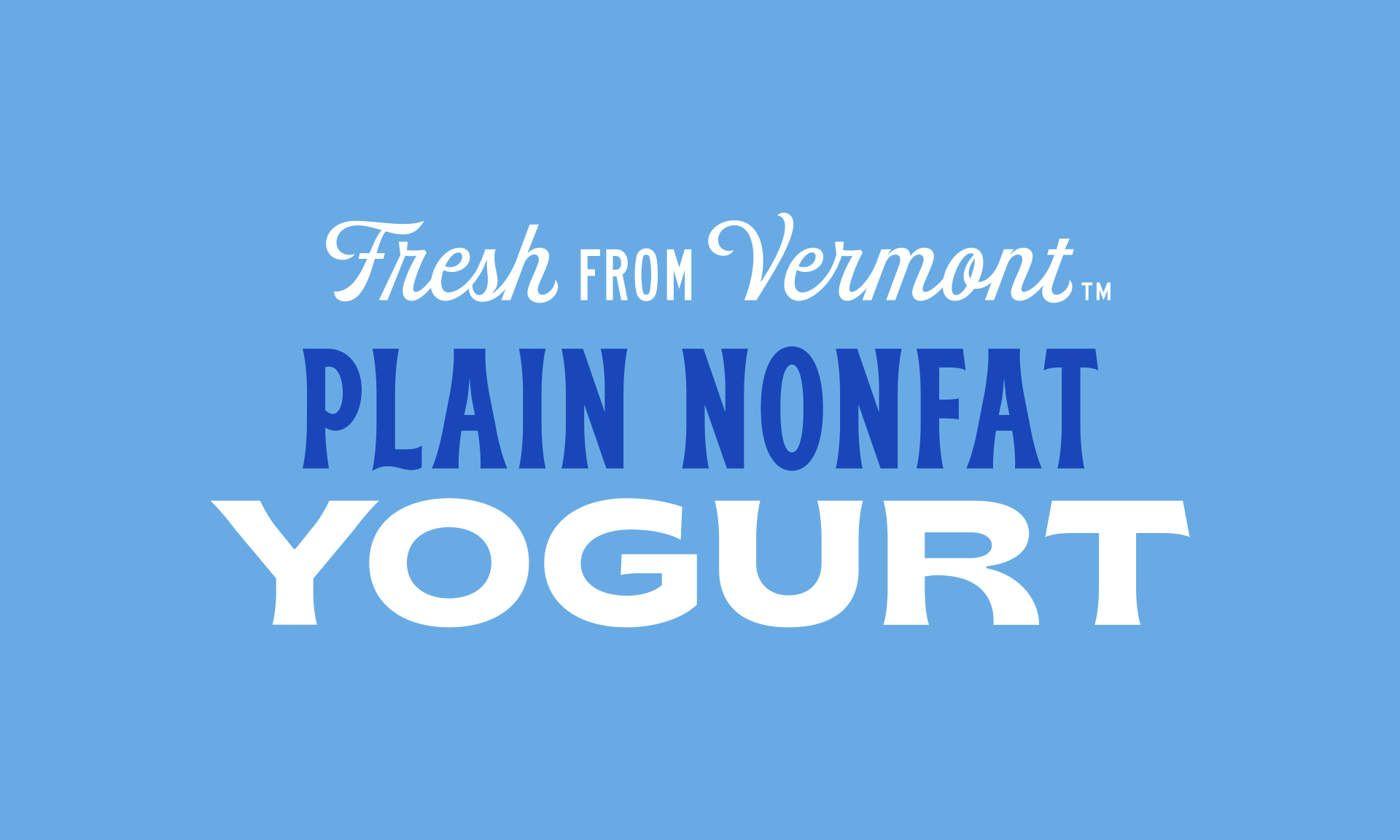
While the typography was big and bold before, it felt more factory than farm. We created a system that could flex and grow with the size of each SKU and gave each product a bit more of its own identity while maintaining cohesion across the category.
We refined language to be more accessible & brand focused. What once was “Vermont style,” an ambiguous & confusing line, is now “Fresh from Vermont,” a proud and ownable statement for all cultured products & Cabot Creamery.
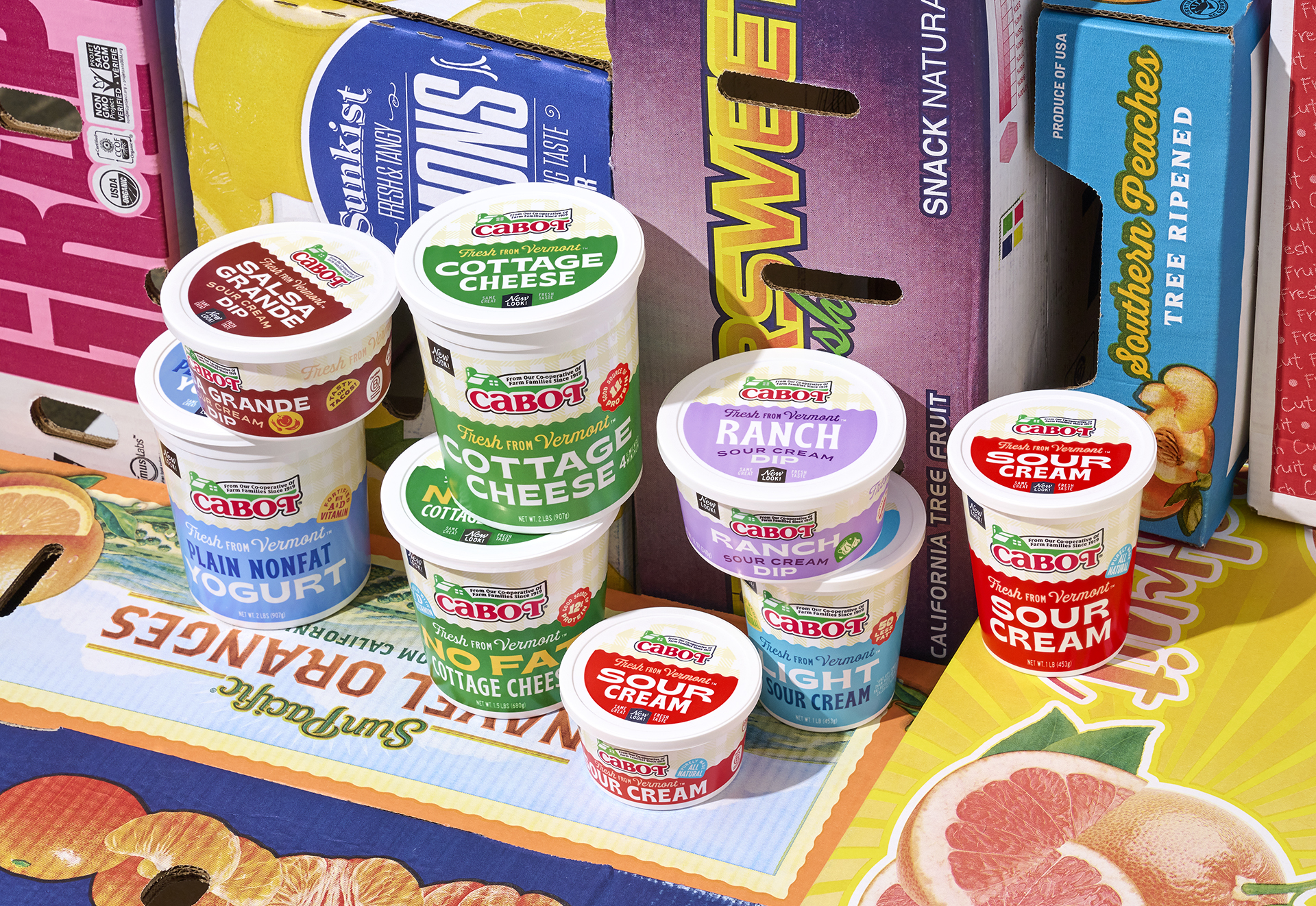
The outcome was a bold & expressive look that stands out in a cooler filled with bland & generic competitors that mostly consisted of small type, soft colors, and no personality.